
WP Engine Navigation

.png)
Project Overview
WP Engine is a WordPress hosting platform that offers hosting to individuals, agencies, and businesses. As the company has grown, its product and plans lines have also expanded. In return, this brought forth a need to redesign WP Engine's site-wide navigation as the company adjusts the way it markets its products, catering each to a certain persona and while speaking our customers language.
Other reasons for the redesign include:
-
Better expose our four product lines
-
Bring forward our agency and enterprise offerings
-
-
Improve SEO, information architecture and site structure
-
Allow our users to see themselves within our website
-
Speak our customers' language with common search topics
-
-
Build a bigger, more prominent menu
-
Provide more options and value to our visitors
-
Update the look and feel of our navigation to decrease clutter, and decision fatigue, while adopting modern UX/UI principles and layout designs.
-
UX Research & Testing
Before joining the Digital Experience team at WP Engine, project timelines did not take into consideration UX research and testing. Thus, big website redesigns were done without any user research from conceptualization all the way to development. Upon joining the team, I expressed my interest regarding UX research and the importance of adding it into our design process.
Fortunately, my team embraced my idea and dedicated time for research and iteration. In addition brainstorming ideas, creating wireframes, and conceptualizing high-fidelity designs, I individually lead the UX research portion of this project. With our limited resources, I set up multiple unmoderated tests in usertesting.com.
For this project in particular, our strategy team had mixed feelings of how to best organize the links in our navigation. The first option was having all our products grouped under one drop down, while the other had them separated under drop downs named catered towards each persona. Thus, our team decided that it would be best to conduct comparative testing to determine which option is better suited for our final navigation.
With a total of 4 tests conducted, below are screenshots of the tasks we used for each round of testing:
-
2 tree tests were set up to identify how easily people can find information and exactly where they get lost. Users rely on your information architecture — how content is labeled and organized— to get things done.
-
1 comparative usability test was used to to gain valuable insight on any pain points or user confusion centered around our design. More importantly, it shed light on the positives and negatives between the two navigation designs we tested.
-
1 usability test was conducted on our final navigation design to reevaluate our layout and organizational choice changes.

Tree Testing Tasks

Example of how our tree test looked like

Comparative usability testing and final usability testing tasks
All tests utilized usertesting.com's panel selection feature that recruits a panel of participants comprised of real people in their natural environment who have been screened to meet the criteria we have set for them through audience selections and screening questions. This ensured that the users we tested were familiar with WordPress hosting, and website development, and in return met our target audience/customer base.
After each round of testing, I compiled a miro board in order to summarize the findings of each test while highlighting user frustration points, the time it took to complete each task, task success rate, as well as any feedback and comments that the users had. This affinity map served as a basis for the team to reference while iterating our design.

I would also like to highlight the two navigation variants that we tested as a comparative usability test and shed insight on the results we gathered from each. The results of the test helped us direct our attention towards which organizational structure worked best for our company products and links, while also offering feedback to how we can improve the UI of our navigation.
Navigation A

-
Products are all found under the Products drop down, while some are reiterated under their respective persona.
-
All "company information" lives under one drop down, adjacent to the product line.
-
Extra space can be used to include a CTA.
Navigation B

-
Products are all found under the Products drop down, with no regard to personas.
-
"Company information" lives under all three navigation drop downs
Our user testing showed multiple pros and cons to each variant, but was enough to help us determine which design to move forward with. Here are some key results:
-
Nav A showed better results when it came to users identifying which product suits their case scenario most.
-
Nav A and B both did not do well to differentiate our SMB product versus our Enterprise product (50% and 43% split)
-
Nav A did better overall when it came to tasks regarding seeking "help" or "resources" (77% success rate, compared to 54% for nav B.
UX Design
While redesigning the site-wide navigation, our team went through multiple design iterations (wire-framing all the way to final prototyping) before finalizing the design that is now live on our website and can be viewed here.
Below are screenshots of our previous navigation that highlight the problems it had, our current navigation detailing the changes made, and our mobile navigation design.
Previous Navigation

Very vague term
"Pricing" isn't an enticing link to click on.
With WPE having multiple online blogs, magazines, ebooks, etc. How do we display these links while reducing clutter?
These two links need better wording. When should one contact sales rather than get support? And vice versa.


1. Drop down background and text color do not meet contrast requirements for accessibility.
2. Gradient background is outdated and needs to updated to a lighter look and feel.
4. Inconsistent links (buttons, tabs, jump to link) under drop downs create a confusing experience.
5. Inconsistent experience across each navigation drop down can be a pain point and must be addressed.
3. Tabs that filter by persona are hidden and have a low click rate.
New Navigation
Moved "pricing" to a "buy now" button

"Products" is a clearer term that entices users to click on it in an effort to increase conversion.
One contact link causes less confusion and is a one stop to all forms of contact.
Added carats to clearly indicate a drop down
Two persona drop downs catered towards our biggest customer bases.

Introduced a dark version of the navigation to be more inclusive to those with accessibility needs and to match our old pages on the site that have not been updated to a lighter look and feel.

1. Lightened the navigation experience while expanding the sub-navigation to be full page width. This gives the nav more visual importance.
2. Created relevant content groupings to reduce content fatigue.
3. Introduced relevant primary CTAs for each product line.
4. Created consistency of experience across all main nav items by keeping the layout and design the same.
5. Divided sub-nav with 2 background colors to highlight main content
6. Included hover states to indicate clickable menu items and distinguish them from sub-head titles.
Mobile Designs
Designing webpages requires designers to think of the customer experience across all devices. We need to make sure that the design of our page on mobile is adjusted to suit a smaller screen size and different ways of interaction (ex: tappable rather than clickable interactions). However, the design should be consistent with that of desktop so that there isn't friction in the experience of a visitor viewing our page across multiple devices.
Below are some call outs to how we created a pleasant and well-functioning mobile experience for visitors.

Research shows that all customers buy on desktop. 50% of total visitors browse on mobile. Thus, "Buy Now" is replaced with "Plans and pricing" to reduce assertiveness and urgency.
Drop downs are redesigned to accommodate mobile devices. Each link has a clickable width of 44px to ensure it is accessible and allow accurate thumb clicks.
Icon is removed to keep visual hierarchy of "contact" consistent with the rest of the drop downs.
Contact sales is removed from a drop down for quicker access to those who need it.
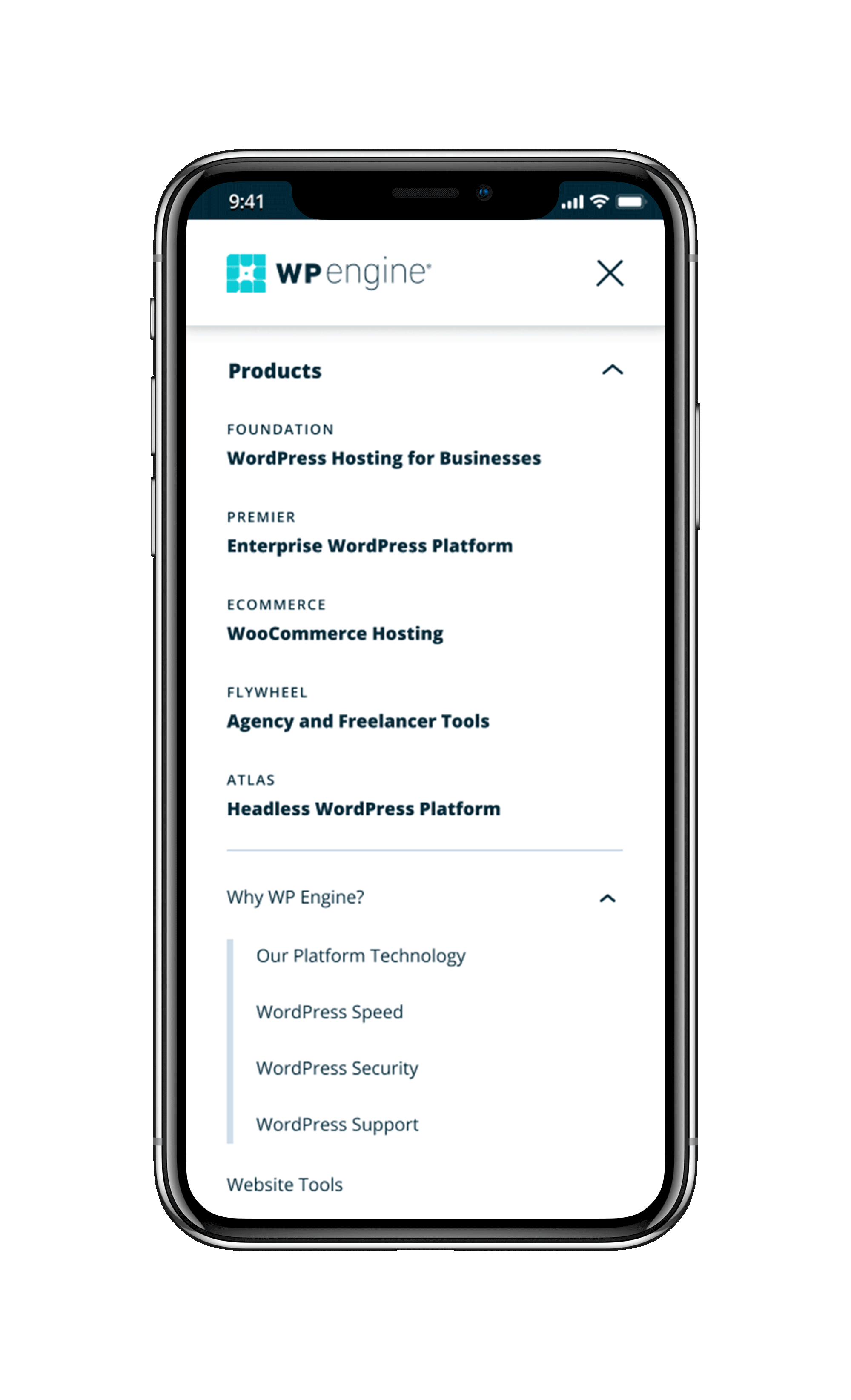
Main nav is fixed upon scrolling to allow flexibility in exiting.
The background color of open drop downs changes from light grey to white to visually separate between elements in the nav.
CTA is modified to adjust for device size. Icon is removed and background color is changed to keep an element of visual interest.

Although our products list on desktop is under a sub-heading, we decided to have them listed out to increase visibility.
Hierarchy between our navigation links is established through font size and weight changes.
Our tertiary navigation links are indicated by an indentation and decorative line.
Through research and design our team redesigned our site-wide navigation to tackle all the problems iterated above, while also adjusting the look and feel of our nav to be cleaner and more modern, and improving our mobile experience.
Key metrics to the success of this project include: visitor engagement, contact with sales, and increase in recurring revenue.
The live navigation can be viewed here. Please note that some elements on the site might look different than what is on my portfolio– our team is constantly working on improving our design as we gain more insight and analytics results.
Results
After development and QA, our strategy team set up an A/B test on our live site which showed 50% of our visitors the old navigation, and showed the other 50% our new design.
After running this test for three weeks, we could confidently say that our new plans page redesign was a success! Below are some of the results that our new navigation yielded as compared to our old one. Consequently, the new navigation was pushed live and is currently on our website.
-
+28% leads
-
+18% opps
-
+100% C/W
-
+169% Bookings
-
+35% ARPU
Variant drove
+36% engagement

Most clicked on item in the navigation
+7% enterprise engagement
+12% APP form submissions
+12% SDR chats
+2% form submissions
.